
Aikido kimori dojo Brand identity


brand identity/strategy/branding/graphic design/web design
Challenge
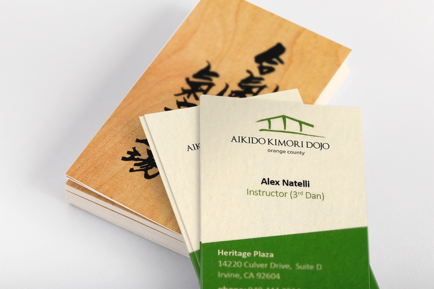
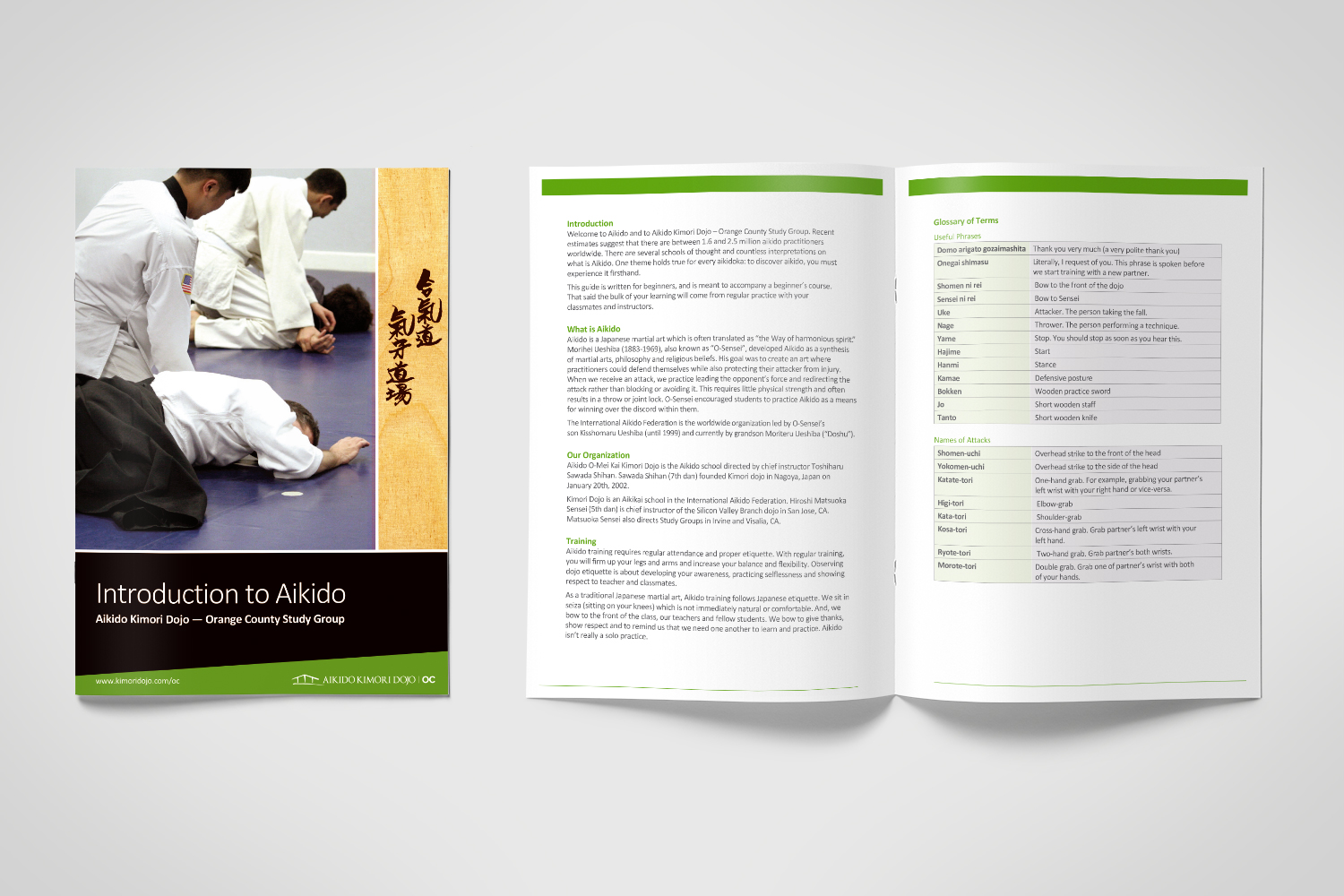
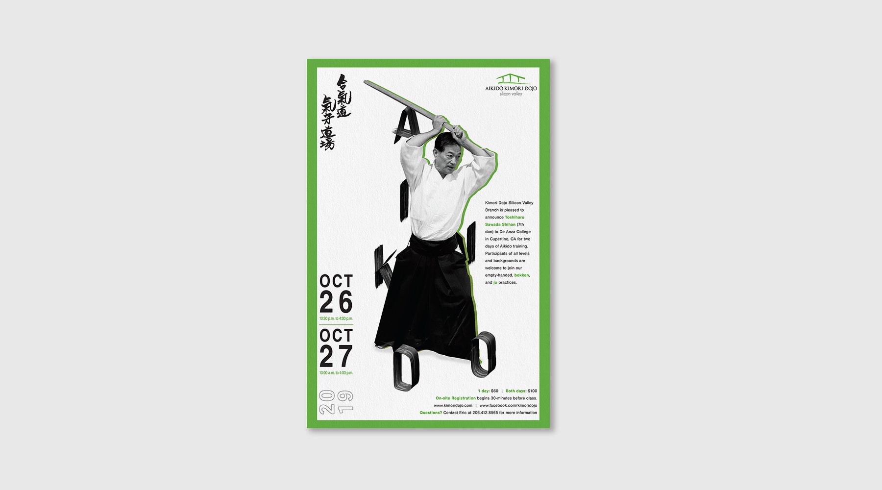
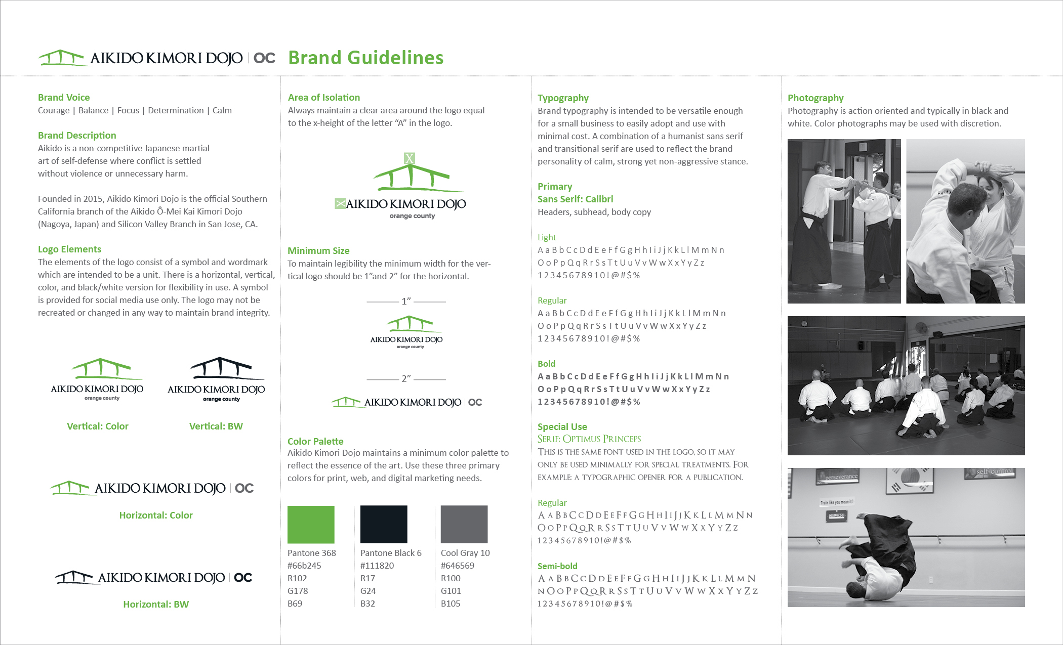
Aikido Kimori Dojo has well respected traditions that served as pillars for starting the Orange County branch by 4th Dan Instructor, Alex Natelli. The goal was to represent the dojo with high standards and symbolize Aikido as a martial art that is more about the intricacies of balance and focus. It’s a unique form of martial art practice to represent visually because it's considered a peaceful art form where strategy and quiet strength are more important than physical strength.
Solution
The solution combined Japanese calligraphy with textures and colors to provoke calmness, peace and harmony. The logo represents structure and foundation of balance. The combination of an all cap type and an intricate serif font indicates strength without being too loud about it.
Website design and development by Sara Natelli: ockimoridojo.com